
Blogs
Filters


FairCom Wrapped: What were we up to in 2024?
We had a busy year in 2024—here are the highlights.
FairCom Edge
FairCom DB
FairCom MQ
FairCom RTG
ProServices
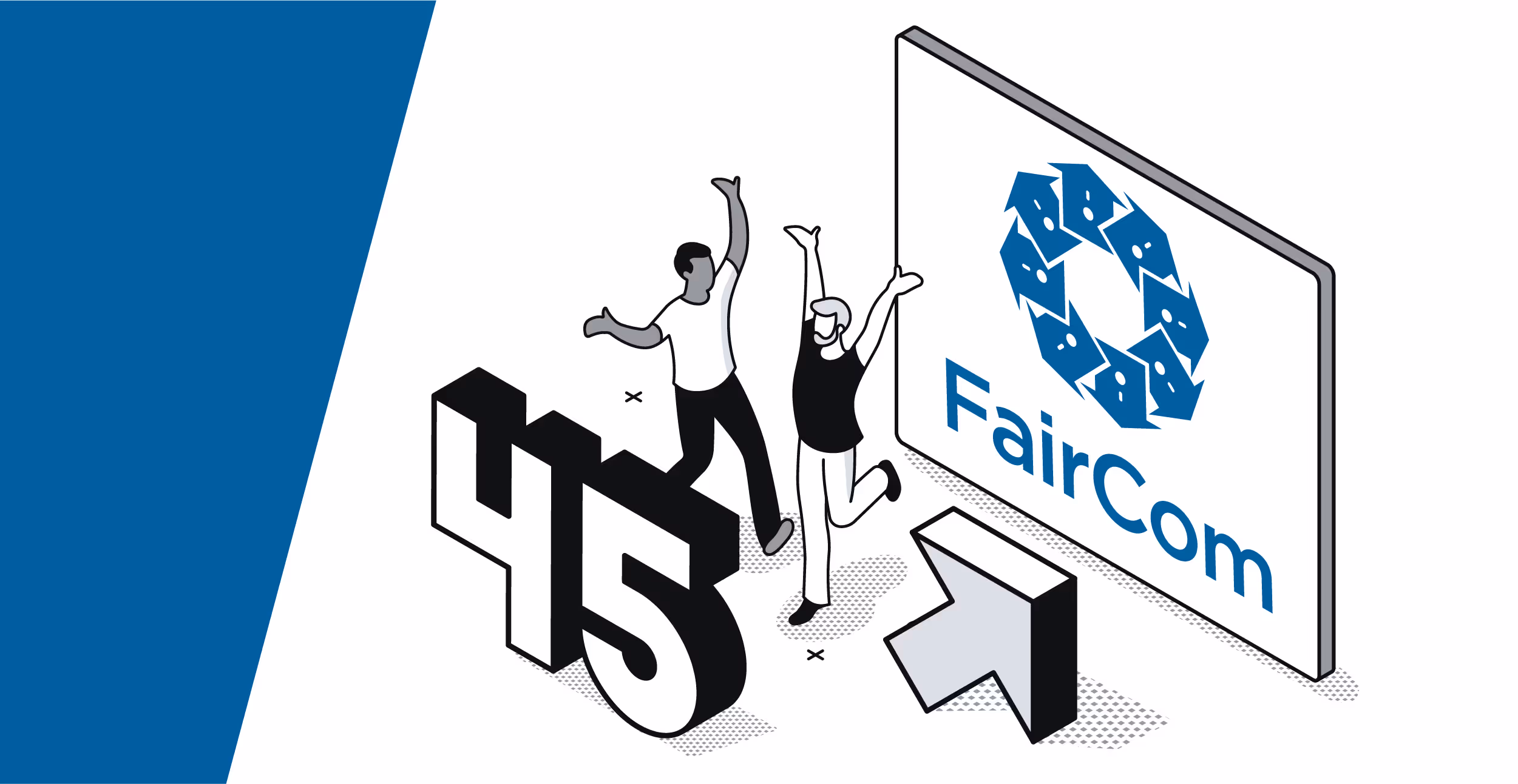
Celebrating 45 years of data excellence
It’s been 45 years since FairCom first innovated how we interact with data.
FairCom
FairCom DB
FairCom RTG
FairCom Edge
FairCom MQ
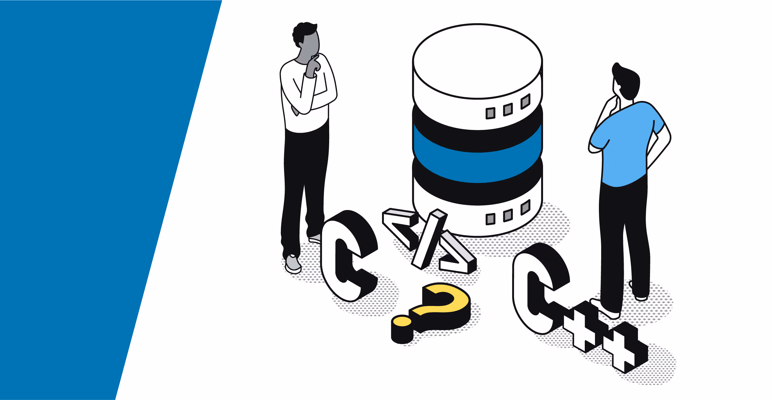
Find the ideal C++ database for C/C++ programmers with FairCom DB
You deserve a database designed by C/C++ developers for C/C++ developers. You deserve FairCom DB.
FairCom DB
SQL
NoSQL
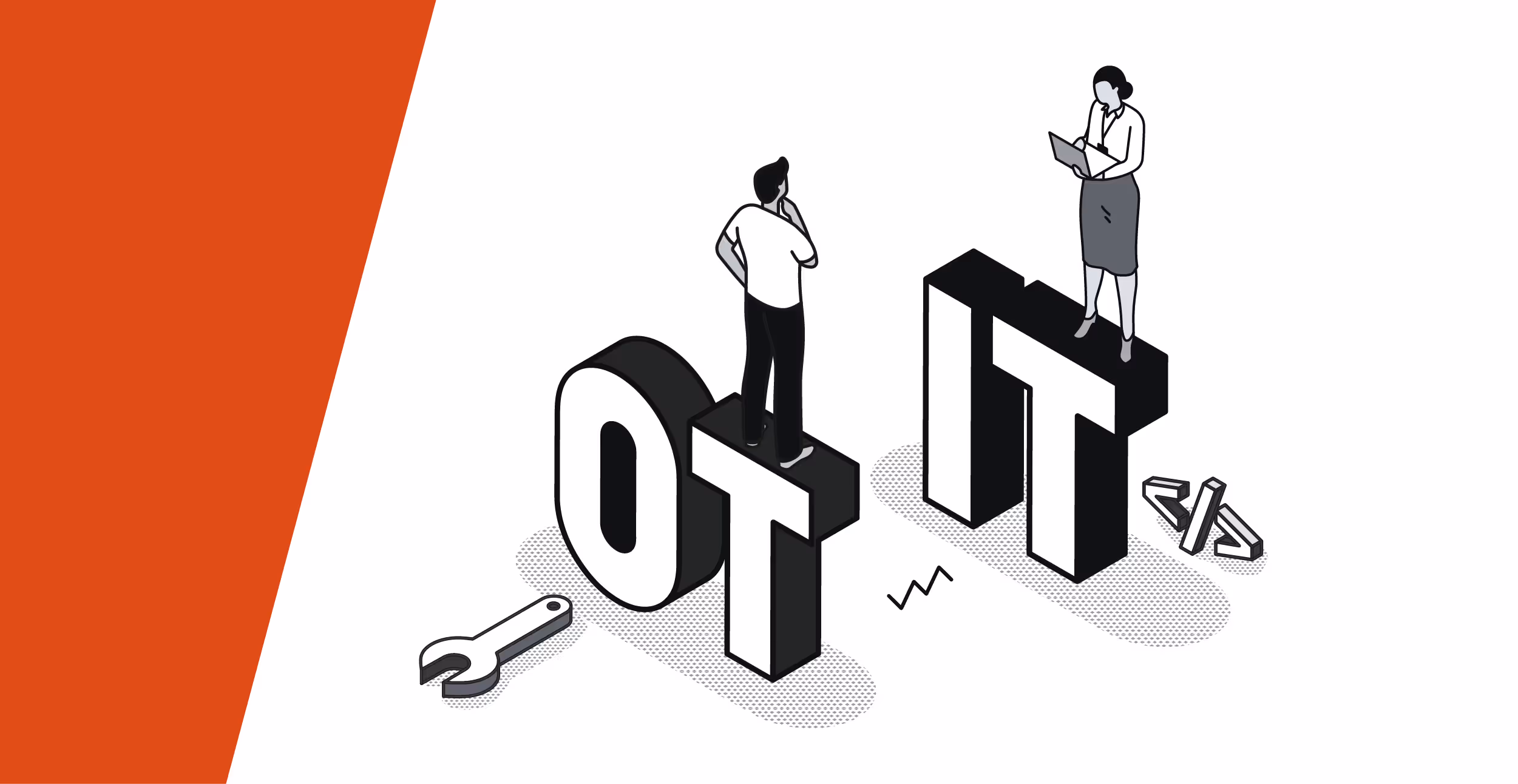
Mind the gap: How to bridge between IT and OT and gain a competitive advantage
Bridging the IT/OT gap is easier said than done—learn how recent innovations in edge computing make this possible.
Edge Computing
FairCom Edge
IoT
IIoT


Sorry, no results found.
Please try different keywords.
Please try different keywords.